Line: are marks made by a pointed tool: brush, pencil, pen, etc. Lines can vary in width, direction, curvature, length, or color.


I choose this photo because of the lines show really firm to image the way the art work was done is really define line as the bridge is define with wood floor and the mental rail kept on repeating.
Shape: are formed wherever the ends of a continuous line meet. Geometric shapes such as circles, triangles or squares have perfect, uniform measurements and don't often appear in nature. Organic shapes are associated with things from the natural world, like plants and animals.


I choose this photo because all the small shapes thats had on it and different ways the shape were design on the image.
Color: wheels show the primary colors, secondary colors, and the tertiary (intermediate) colors. They also show the relationships between complementary colors across from each other, such as blue and orange; and analogous (similar or related) colors next to each other such as yellow, green, and blue. Black and white may be thought of as colors but, in fact, they are not. White light is the presence of all color; black is the absence of reflected light and therefore the absence of color.


I choose this photo because of the strong value of color shown on the flower all the different color was shown with a hardcore stand on the .
Value (Tone) : or tone, refers to dark and light; the value scale refers to black and white with all gradations of gray in between. Value contrasts help us to see and understand a two-dimensional work of art.


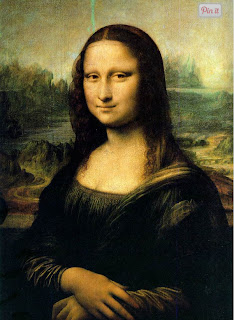
I choose this photo because of the color its had realistic to the image to how is pencil blend goes and try make a 3D out of it well the image is almost same as the ART.
Form:escribes objects that are three-dimensional, having length, width, and height


Texture:can be rough, bumpy, slick, scratchy, smooth, silky, soft, prickly--the list is endless. Texture refers to the surface quality, both simulated and actual, of artwork.


I I choose this photo because of the paper texture to it how the paper old and how someone draw a bull on it should the texture of it just like the three the texture was shown on it how the layer of wood the three has as a texture.
space: refers to distances or areas around, between, or within components of a piece. Space can be positive (white or light) or negative (black or dark), open or closed,shallow or deep, and two-dimensional or three-dimensional.


I choose this photo because the space and the emotion of the image being formed by the guy and how the lines show the space they made when they come across each other .


Contrastance: is created by using elements that conflict with one another. Often, contrast is created using complementary colors or extremely light and dark values. Contrast creates interest in a piece and often draws the eye to certain areas. It is used to make a painting look interesting.


Emphasis:in the focal area of an artwork gives it importance. An artist may stress some elements of the design over others. The eye of the viewer will focus on the area of emphasis or center of interest first, then take in the rest of the composition.


I chose this photo because of how how image is communicate with others and express the way there emotions are being let out just as the holding a different way side performing trust.
Movement:in an artwork means the artist is taking viewers on a trip through the work by means of lines, edges, shapes, and colors often leading to the focal area. Movement is a visual flow through the composition. It can be the suggestion of motion in a design as you move from object to object by way of placement and position. Directional movement can be created with a value pattern. It is with the placement of dark and light areas that you can move your attention through the format.


Pattern:are made in art when the same shapes or elements are repeated again and again. Pattern uses the elements of art in planned or random repetitions to enhance surfaces of paintings or sculptures.


Rhythm:is the repetition of shapes, lines, and forms. Rhythm is a movement in which some elements recurs regularly. Like a dance, it will have a flow of objects that will seem to be like the beat of music.


unity:means that all elements in an artwork are in harmony. Unity brings together a composition with similar units. For example, if your composition was using wavy lines and organic shapes you would stay with those types of lines and not put in even one geometric shape.

I chose these pictures because how the image of the paint was urge on way the made almost unlike if she was jumping in the and the lady behind the image looks was captured by photo but was as paint the paint almost look like if every detail poops out and creates live image of a art.


